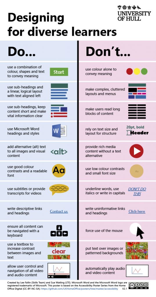
A list of things to always do - or avoid to help with inclusive and accessible design.

Designing for Diverse Learners: A new dawn

Last week I had the pleasure of launching the new version of the Designing for Diverse Learners guidance at the ALDinHE Conference 2022 alongside my colleague Tom Tomlinson. It is fair to say that this release is mainly due to the hard work and dedication of Tom. He worked to painstakingly bring the Designing for Diverse Learners work out of rigid PDF formats designed for print into a modern accessible designed for the web. The one thing that has me the most in awe is how Tom has helped preserve the overall look and feel that helped make this resource so successful in the first place. It is fair to say we’re both really excited to bring this to the wider community and we can’t wait to see what you think.

Sitting behind this new release was a broader project team supported by Kate Bridgeman and Conor Start at Hull as well as Kate Wright from Aberystwyth who helped bring the original poster into the Welsh language. As part of this work, we reviewed each and every single item on the poster, refining each point for clarity, precision, and accuracy. We tweaked here and there – with the end result keeping the spirit of the original work with some added information to really hammer the point. We’ve also supported each set of guidance with a full-page that explains the why sitting behind the instruction. I think this will really help ‘sell’ these points to educations, but also provide them a quick start by linking to relevant guidance.

Designing the Designing for Diverse Learners resource

This release broke free from the confines of a PDF/poster into a fully dynamic, online website. These changes make the resource as accessible as possible for users while providing a responsive design to maximize device compatibility. This is all while retaining the original always/avoid instructions in a split format. My favourite piece of Tom’s handy work is how the resource scales, maintaining two columns for large screen and print – but switching to cards on smaller screens. Tom has written up a more detailed account of this transformation in his recent blog post.

Another significant aspect of this version is the multitude of formats. We’ve switched to HTML/CSS as the main mode of delivery, providing an accessible and dynamic experience. This is, however, still backed up with a print version for anyone wanting to keep the resource as a handy quick reference guide on their desk. We’ve also provided both PowerPoint and Google Slides to help maximize the reach.

Reuse and licensing

This version maintains the same CC-BY-NC-SA Creative Commons Licence. This license has been a significant enabler in allowing re-use and adaptation. After all, it is under the terms of this licence that our work was able to evolve the original guidance from The Home Office. As with the previous versions, users will be able to reuse, remix and adapt this work for non-commercial means as long as they too share-alike. I’ve previously reflected on this license and how it has enabled our work in the CLA Blog. One-touch that I think works particularly well is that Tom has also bundled the icon pack into a separate download package. This will further enhance the re-usability of the poster and allow others to use it in their own contexts. We’ve seen our original work significantly evolve – and we can’t wait to see where it goes next. If you want to help us take this resource further – please fill in this form to get involved.

Finally, I know not everyone was able to make our ALDinHE Conference session. Please find the slides below – in case you are interested in what we shared:

ALDinHE Conference Presentation: Designing for Diverse Learners


I cannot believe it is over four years since I last blogged about this. What else would you like to hear about this?

Dear computer programmers. Please make accessibility easy.

Why does accessibility need to be so difficult?

I’m sat in my hotel room, using my last few minutes before the start of the ALDinHE Conference to reflect on accessibility. Part of the reason for this is the journey I went through to make a resource about accessibility accessible. It isn’t as easy as it should be…

I have a graphic design background, and I have been trained in the use of Photoshop and InDesign – both industry standard pieces of software for the creation of materials. However, when I first learned these tools, the concept of accessible design was not at the top of anyone’s mind – or the top of the feature list for any program. Time change thankfully!

Take Microsoft Office 365 for example. Nearly every update for the last three years has included significant new features – or tweaks that make accessibility even easier. In contrast, Adobe may have created the features – but they are kinda buried and not easy to use. Designers are not the most famed for their accessibility credentials. Furthermore, many of us may not have been trained in how to create accessible materials or the importance of doing so. This is especially the case if the designer has been qualified for some time. Generalisations – I know, but, also generally true.

I need to talk about Microsoft Office a bit more to illustrate my point.

For example. I insert an image into a Microsoft Word document or PowerPoint presentation. If I right click on that image, in the context menu, I can clearly see the option to add alt text. Awesome!

A screenshot of a Microsoft Word context menu. It shows the option to 'Edit Alt Text...'

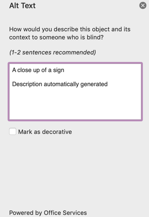
When I select this option, I can see the ability to add the alt text. If I have Microsoft Intelligent Services enabled – it’ll even have a go at filling it in for me. I also have the option to make the image as decorative. Awesome!

A screenshot from Microsoft Word showing the side panel to edit Alt text. It shows a dialog to edit alt text or mark it as decorative. It advices 1-2 sentences and states "How would you describe this object and its context to someone who is blind"

When I head to the review ribbon, I’ll see the Accessibility Checker has a prominent place. It’s right alongside the Spelling & Grammar checker, Read Aloud and the Translate option. It normalises checking for accessibility. Again, this is awesome!!!

So now I get to my point. Microsoft has been pretty ‘awesome’ at making accessibility a prominent, normalised feature. Now let’s look at Adobe InDesign – a piece of ‘industry standard’ software that is used for thousands of posters, books and resources. Now I know this software is for ‘professional’, users, but why do they need to bury accessibility?

For example, to add alt text, you need to choose ‘Object Export Options…’

A context menu in Adobe InDesign. It says Object Export Options...

This is not clear. No one would think to click on ‘Object Export Options’ to get to alt text. You then get this less thank helpful dialogue:

The Alt text dialogue in InDesign.

This is nowhere near as clear as the options in Word. What’s worse, is adding the text is not enough. There are a series of options and tick boxes that need to be selected, and the document needs exporting in just the right way. If all this is done correctly, it is highly accessible. However – it is not easy. If we want to encourage designers to make stuff accessible, those options need to be accessible too!

I am not criticising Adobe for their features. InDesign is powerful, and has *everything* you need to make a document accessible. However – all of these features are buried. In the current social climate, this should be a lot easier and a lot more prominent.

If you need any more convincing, see this dialogue between me and another user on the Adobe Forums Community trying to figure out how to get it working!

In short, Microsoft one, Adobe nil on this one! Once again – not because of the options in the program, but because of how easy and prominent they are to use. It simply sends the wrong message!

Designing for Diverse Learners

This post will detail the Designing for Diverse Learners Project that I am undertaking with my colleague Sue Watling from Learning and Teaching Enhancement, University of Hull. This post is published on both of our blogs, and you can check out Sue’s blog Digital Academic.

The Home Office launched an excellent poster series to highlight practices for developing content for users falling into one of the following six categories:

  • low vision,
  • D/deaf and hard of hearing
  • Dyslexia,
  • motor disabilities,
  • users on the autistic spectrum,
  • users of screen readers (visual issues/blindness).

We we really impressed by these posters, but also overwhelmed with how we can support educators to use them in practice. For this reason, we worked to develop our Designing for Diverse Learners poster, combining the essential practices for all of the above. The aim of this document was not to target any one group of learners, but to develop an outline of practices that follow the principles of universal design where changes for some benefit the vast majority of learners.

The Poster: Designing for Diverse Learners

We have made this poster available in two formats, the image below and a printable PDF. For best results, print your poster on A3 paper (portrait orientation) and trim the white paper to the sides.

This poster outlines some best practice guidelines for learning design

Why ‘diverse learners’?

The idea of ‘diverse learners’ is really important to the both of us. The practices outlined in our poster will benefit every learner, not just those who many require specific adjustments. The reason we are able to do this is that in applying the principles from the above posters to the educational context, we are able to look at them for the specific purpose of designing digital learning materials and opportunities.

One of the reasons for our initial focus on digital resources is our institutional context at the University of Hull where the majority of resources will be access via the institutional VLE, Canvas. The University of Hull has a set of ‘expected use of Canvas’ criteria which include the following:

Staff should ensure that all digital content supporting learning and teaching e.g. text, images and multimedia, follows inclusive practice guidelines.

Our poster does not claim to support every single learner or requirement an educator may come across, but we are certain that resources developed along these principles will meet the vast majority of needs. We are also keen to frame this as a working document. We are keen to get as much feedback as we can to help us make this resource event better. We’ve already had some feedback about including some text line spacing and would welcome any further ideas you all have.

Future developments

As a community, we can continue to develop this resource and make it even better. We welcome input from both educators and learners as to how we can make this any better. We have set-up a Tricider to help collect feedback on the poster and to enable to community to vote on individual ideas. If you have not used Tricider before, it is very easy to contribute. Simple visit our Tricider and either ‘add an idea’ or vote on the ideas of others. You can also place comments on Tricider or use the comment area on this blog post if your prefer.