Why does accessibility need to be so difficult?
I’m sat in my hotel room, using my last few minutes before the start of the ALDinHE Conference to reflect on accessibility. Part of the reason for this is the journey I went through to make a resource about accessibility accessible. It isn’t as easy as it should be…
I have a graphic design background, and I have been trained in the use of Photoshop and InDesign – both industry standard pieces of software for the creation of materials. However, when I first learned these tools, the concept of accessible design was not at the top of anyone’s mind – or the top of the feature list for any program. Time change thankfully!
Take Microsoft Office 365 for example. Nearly every update for the last three years has included significant new features – or tweaks that make accessibility even easier. In contrast, Adobe may have created the features – but they are kinda buried and not easy to use. Designers are not the most famed for their accessibility credentials. Furthermore, many of us may not have been trained in how to create accessible materials or the importance of doing so. This is especially the case if the designer has been qualified for some time. Generalisations – I know, but, also generally true.
I need to talk about Microsoft Office a bit more to illustrate my point.
For example. I insert an image into a Microsoft Word document or PowerPoint presentation. If I right click on that image, in the context menu, I can clearly see the option to add alt text. Awesome!

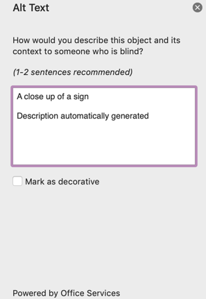
When I select this option, I can see the ability to add the alt text. If I have Microsoft Intelligent Services enabled – it’ll even have a go at filling it in for me. I also have the option to make the image as decorative. Awesome!

When I head to the review ribbon, I’ll see the Accessibility Checker has a prominent place. It’s right alongside the Spelling & Grammar checker, Read Aloud and the Translate option. It normalises checking for accessibility. Again, this is awesome!!!

So now I get to my point. Microsoft has been pretty ‘awesome’ at making accessibility a prominent, normalised feature. Now let’s look at Adobe InDesign – a piece of ‘industry standard’ software that is used for thousands of posters, books and resources. Now I know this software is for ‘professional’, users, but why do they need to bury accessibility?
For example, to add alt text, you need to choose ‘Object Export Options…’

This is not clear. No one would think to click on ‘Object Export Options’ to get to alt text. You then get this less thank helpful dialogue:

This is nowhere near as clear as the options in Word. What’s worse, is adding the text is not enough. There are a series of options and tick boxes that need to be selected, and the document needs exporting in just the right way. If all this is done correctly, it is highly accessible. However – it is not easy. If we want to encourage designers to make stuff accessible, those options need to be accessible too!
I am not criticising Adobe for their features. InDesign is powerful, and has *everything* you need to make a document accessible. However – all of these features are buried. In the current social climate, this should be a lot easier and a lot more prominent.
If you need any more convincing, see this dialogue between me and another user on the Adobe Forums Community trying to figure out how to get it working!
In short, Microsoft one, Adobe nil on this one! Once again – not because of the options in the program, but because of how easy and prominent they are to use. It simply sends the wrong message!